Introduction
Marvel App is a free software program that I used to build the SMARC prototype. It can create desktop and mobile prototypes to bring ideas to life and transform how the products are displayed virtually. The design process is straightforward to follow. The intuitive design and prototyping tools have helped me to wireframe, design and prototype fast. Instantly generate design specs and connect integrations that power up the workflow.
Motivation & Learning Goal
I used Marvel App because I didn’t know how to build a website. Fortunately, Erika introduced me to Marvel App, and she used this to showcase her Maker Project last semester. So she’s kindly showed me how she built her website in Marvel App. I wanted to display how the user can interact with SMARC from the first interaction when they see SMARC to the end process when they wish to request collection for SMARC. Using Marvel App flow and sequences can help me with illustrating this user journey. My learning goal for this semester is to design a good website layout to create a good user flow and journey map so the user can have a better experience with the SMARC interface.
Process and Creation
- I used the pages that I created using Canva and copy them into Marvel App to speed up the process. I could design everything in Marvel App from the scratch but due to the limited time we have before the Demo Day, I wanted to utilise what I have build previously. Fortunately, Marvel App allowed me to use images as the design.
- I started to upload all the images that I wanted to display on the Marvell App website (20+ pages).
- Go to the first page that I want to be as the front cover of SMARC and click the area that I want the user to interact with.
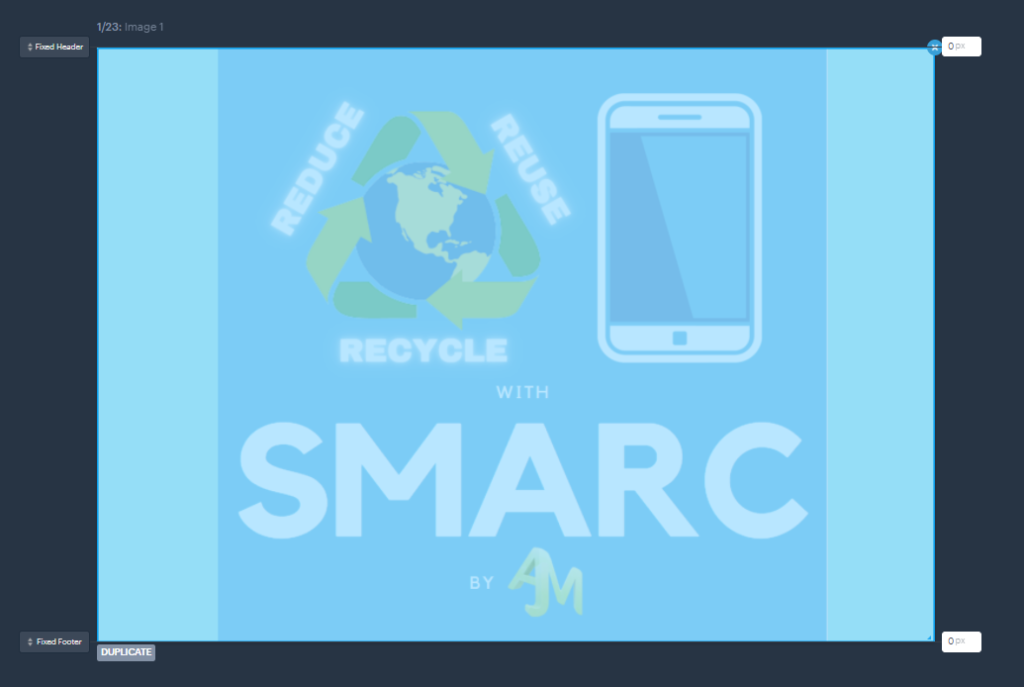
- Select the next page you want to display
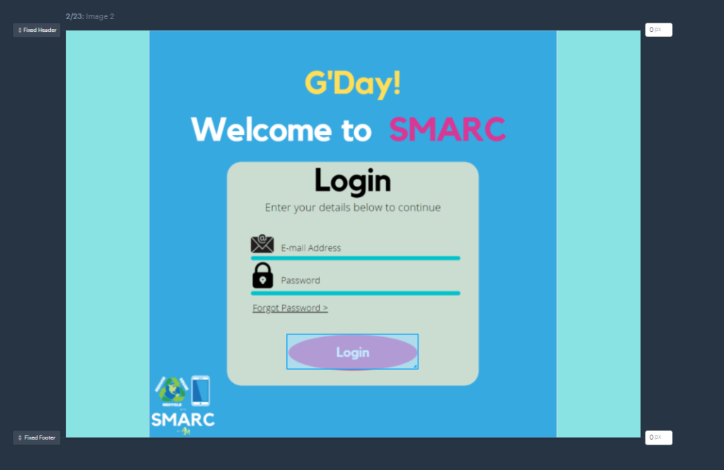
- Select how you would like the screen transition to appear for the user such as flip, flow, slide up/down, pop, push, fade, etc.

- Choose the action you want the user to interact by clicking, hovering, swiping or pinching.

- Do all these steps again for the remaining pages
- Once you finish, click Done on the top right corner.
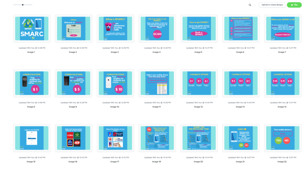
- If you click the Play button, it will take you to the website and you can start to play/interact with the pages based on what you have designed. This is the example for our SMARC website and please feel free to check it out.
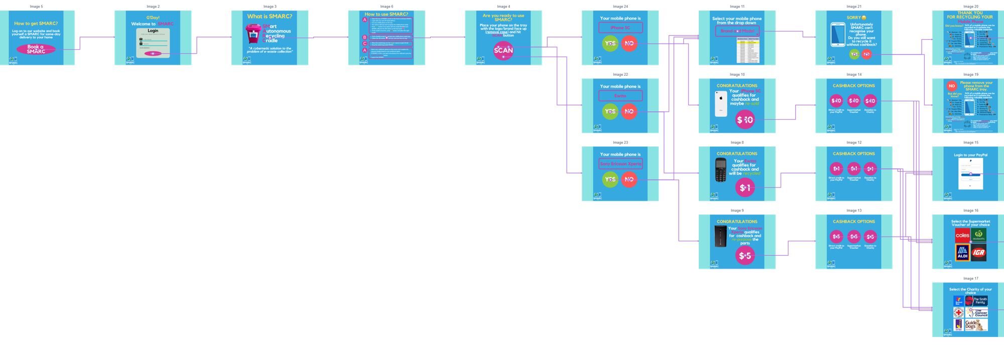
- It can generate the User Flow automatically from the Menu button on the bottom left corner and click the View Userflows.
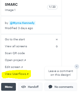
- This is SMARC Userflows generated in Marvel App.

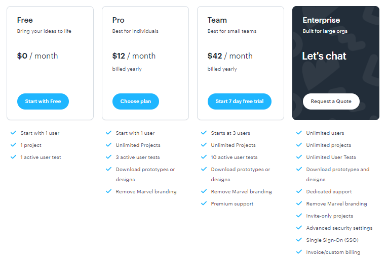
Similar with Canva & Miro where everyone can use it for free, Marvel App also give you free access to use and create your prototype. I find it relatively very intuitive and easy to use to design and create but to collaborate with other people you need to pay for more access and more project. So my team members can only view, leave comment and interact with the design that I created, but they can change anything.
Skill Level
| Previous Skill Level | Current Skill Level | Desired Skill Level |
| N/A | Advance Beginner | Competent |
Overall, based on the Dreyfus Model of Skill Acquisition, I would categorise my current Skill Level on Marvell App as Advance Beginner level now, moving from Novice level having zero experience before joining Masters Program this year.
Reflection
I enjoyed creating the website prototype in Marvel App but I wish I could collaborate with my group member too without paid subscription, especially if the purpose is for learning and not commercialising anything. Perhaps in future I might try build this website design using different program. Overall, it has been a valuable skill to learn and make me think how to create a better user experience design from the user perspective for all cyber-physical systems that we create in future.
Acknowledgement
- Erika for introducing me to Marvel App and explaining how she did it for her Maker Project on Semester 1, the Democracy Machine.
- Julian for providing his feedback and comments on the Marvel App flow to make a better user experience for SMARC.

